|
iCE
9811 - score: 8.5 out of 10
God Among Lice:
Ice delivers this month with a great release, with pretty
consistent quality throughout. If you like ice, then you'll
probably love this pack. If you're not a big fan of ice,
you'll probably still be impressed by the large number of
quality images created by some talented artists.
It's nice to see the versatility
of an artist like Darkmage who's just as able with the digital
airbrush as he is with his rendering (although not spectacular
with either one). The consistency of mood throughout all
his works is a plus in my book, too. "The Demoness" is a
lot easier for my eyes to look at than the Yet-Another-Rendered-Spaceship
scenes, though. And those logos are pretty clean looking,
but uhm.. oh, they're just logos why am I wasting my time
talking about them.
Pnakotic's alien bar scenes
create a really convincing and creative setting and mood,
but his 3rd pic (pn-intr1.jpg) is a failure as a composition.
Like some of his work from the previous pack it looks curiously
like a completely random still from an animation, as if
it was never meant to be seen as a static 2d picture.
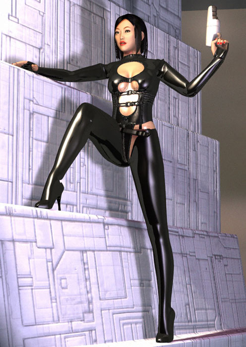
For an example of quality composition
in a rendered work, look no further than Steven Ståhlberg's
lovely lady in black. The steeply stepping wall leads the
eye up the exquisite line of the leg, boldly exposing what
I think most 3d artists would be afraid to show. As an illustration,
the focus is correctly on the main character, and indeed
on the beautifully accurate anatomical lines of the model.
At the same time it also plants her firmly in a proper,
physical setting.
Turning to freehand, Jae's
seamonster is probably the most impressive piece in the
pack. Tremendously detailed, well colored, not much to say
other than "wow". There seems to be more texture here than
normally in Jae's pics. Great to see him adding yet another
element to his artwork.
The Necro's nf-mekka.jpg is
just about as impressive. The bright, tightly airbrushed
look gives his pictures a kind of... lush moistness that's
heaven to look at. With more attention to small details
of shading than the typical wider Catbones airbrush, it
is better compared to demoscene pixel art. No hiding unfinished
areas with bubbles all over the place, either.. necro actually
draws some flowers and vines for framing purposes.
The Knave keeps up the heavily
self-touted "newschool abstraction" with this pack. Since
this style is pretty consistently the same, I'll give my
opinion of it here and not have to worry about dealing with
it all the time in the future. When I first encountered
this style, it seemed like an obvious borrowing from Tomppa1.
I've since been able to appreciate the differences between
their work. Basically the difference is this: whereas Tomppa1
was able to use his cross-hatching and shading to create
a wonderful play between flatness, depth, and overlapping
planes, The Knave merely uses them as a kind of pictorial
surface effect, more like a comic or cartoon I guess. There
is very little depth to The Knave's pictures, and so the
hatching seems to me kind of useless. His best pic in this
pack, "the sun-setters", does show that despite this fact,
he can still achieve an idea of picture space through including
the sea and boat in the middleground and background, a device
that he would do well to add more often to his other pictures.
The parts that make up the picture are nicely composed and
arranged as well, and the colorful palette is applied wisely.
Quickly, the rest: root88's
seamlessly tiled "wisdom" is intriguing. DaVinci's pretty
girl in bathing suit with melting ice cube is, well, pretty.
There's a cute, smooth looking toon character from Jamie
McCarter. Megalith looks to have taken a Kraftwerk video,
given the mannequins more of a rubbery skin like those pleasure
doll things, and set the whole thing in some kind of spooky
empty warehouse in the middle of the woods. Mantis is just
a pervert. ;) One wonders if those mannequin people are
male or female. Well, I guess one is obviously male. Martin
Heigen... oooooh I get to see a mech. I feel so special.
AE's rendering is pretty solid, if uninspired (although
that guillotine IS pretty menacing). Though not hirez, Degenerit's
rip piece in this pack is quite impressive, and definitely
worth looking at (along with all the great ansi). But finally,
what does Tear choose to present to us with her fine creation?
SPAWN. Yes, Spawn.
Spawn.
score: 8.5
Mongi:
If it weren't for
the lack of reviewers, another non-icemember would have
given his/her opinion in this pack. I will try to be unbiased.
The worst things first. It's
not bad, but worse compared to the rest of the pack. Ae's
rendered pics are small, dark and doesn't say much. Although
technically good, they are empty. A pen and a can (smoothly
done), a guillotine, a castle etc are quite common motifs.
Good, but hardly inspiring pics.
Darkmage's rendered work is
very good. They are detailed, massive and the lighting is
done with thought. But they tend to have such sharp edges
on everything. Now I don't know much about rendering, but
I've seen a lot of 3DSMAX stuff that is a lot smoother (not
as detailed, though). I assume the pieces are done in 3DSMAX,
otherwise it might be the software's fault.
The highlight of the pack is
definitely Jae's seaserpent. The atmosphere is perfectly
given by the shading and colors. It's one of the most detailed
pics I've seen in a while. The way the pic is drawn gives
the illusion that you can see every detail in the trees,
the cliffs, even the scales on the serpent. A perfect ten.
The rest of the rendered pics
are really well done, and it's hard to point out any pic
that is better than the other because everything is extremely
good. Steven Ståhlberg's chicks are the single best
modelled humans I have seen, much better than the models
in Poser.
The freehand work is also excellent,
with the new member Necrofiliac (ex-Fuel) being one of the
stars. The pictures reminds a lot of demo-scene pixel art,
only much bigger. The pics are very sharp that way, and
everything looks very smooth, and are very detailed. The
themes are somewhat nasty, though =).
Really, this is a good pack.
I'm not as biased as you think. The last pack was awesome
both ansi and hirez-wse, and this pack is at least as good.
This is a must-download, both for fans of Ice and more skeptical
viewers!
score: 8.5

|