| |
iCE
9902 - score: 7 out of 10
Blup:
Bmx-kt2.jpg
This pic by Bmxmen is basically a 3d render of a kitchen.
The first thing to dawn upon you when you look at this pic
is the "odd" appearance of everything. It seems that everything
has been designed for really short people, hehe. That aside,
while the objects within the scene are generally simple,
they do accomplish their purpose of representation. The
textures of the objects are spot-on, although the various
appliances like the stove, oven, dishwasher and fridge could
do with a little more colour then the beige they are assigned.
The lighting is very bog-standard, but I guess that's probably
due to the purpose of the pic, although it would have been
nice if there was some fairly dramatic lighting effects.
But on a whole, the pic is just, well, boring in terms of
visual appearance and layout, and the grossly misproportioned
objects are no help either. Henceforth I give it a big stamp
of "average".
Ci-linux.jpg
Cyberise gives us a pic of some babe in a rather uncomfortable
position, all in the name of promoting Linux. While it is
a greyscale pic, it does work somewhat effectively. The
shading and forms are realistic enough, however, the overall
shape of the subject's body looks weird, it just isn't 'bumpy'
enough. And where's that other leg of hers. The lower-leg
closest to the viewer is well done, as is the hair and face.
This pic could have been improved with the inclusion of
a background, more careful observation of human forms, and
of course, non-blurred outlines. (Which may also be due
to the image compression, but nonetheless.) The cobweb in
the top left-hand corner is a little intrusive, overall,
the pic is above average, nothing earth shattering nor is
it too bad.
Di-run.jpg
Another 3d pic to grace the icepack this month and it's
by Digital Interface. What is really nice about this pic
is the architecture in both the background and especially
in the foreground. However, the human figure and hands in
the middleground doesn't quite gel with the overall composition.
The hands, while actually having some bumpy texture, look
boneless. The hand texture itself looks like it came from
a rubber glove, (zoom in and see) and unless it was meant
to be like that, it looks out of place. While the face is
quite angular and wizened, it is reasonably effective, although
the hair is cool. It'd be quite a groovy pic if it wasn't
for the seemingly out-of-place giant in the center.
Dm-is.jpg and Dm-tbc.jpg
Two logos, and only one of them, dm.is.jpg, is interesting.
Work it out for yourself.
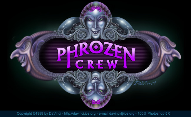
Dv-pc7.jpg
Davinci plugs in another pic for PC, and it's quite nice
too. The sharp outlines of the various objects combined
with smooth and imaginative shading makes this pic a delight
to look at. There is a great amount of attention to detail,
especially on the art-nouveau-esque forms to the sides of
the heads in the center of the pic. A great pic indeed.
Eq-vee.jpg
Egoteq gives us a comic-style pic this month, however, it
isn't quite visually appealing as it could be, this is mainly
due to the quality of the drawing itself. The drawing of
the girl is quite ugly, and full of mistakes, such as the
length of the right arm and the appearance of the hands.
The colouring is okay, although not carefully done in some
places such as the ponytail. The iCE logo is reasonable,
as are the ground and sky, but utltimately the pic is less
then average.
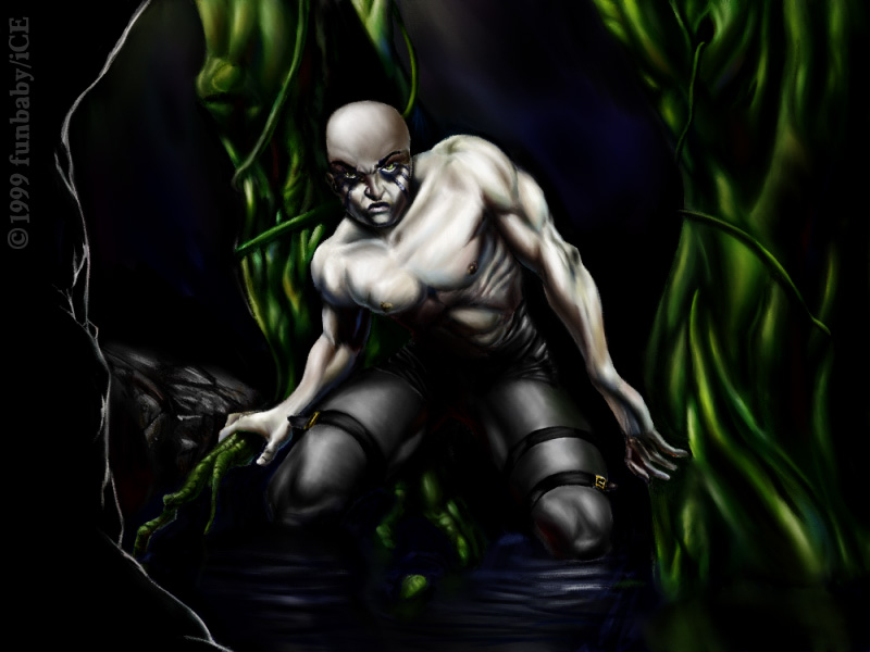
Fb-swamp.jpg
Ah yes, Funbaby is a consistent performer when it comes
to quality artwork. The rendition of the ghoulish-human
is excellent in terms of proportion, shading and colour.
There is a discrepancy with the subject, unless he was meant
to have one arm longer then the other, that right arm of
his has been stretched too far. The simplistic background
highlights the subject well, it is chiaroscuro done well.
Overall this is quite a nice pic in terms of subject rendition,
but maybe, there could be a little more to the background.
Nf-ipro.jpg and Nf-wdra.jpg
Necro brings out his usual demoscene-derived style in two
pics. The first one, a promo for iCE has some nice lettering,
although the face on the right is more of an afterthought.
The pic has been scaled up from half its size, and it isn't
pretty either. This isn't one of his better pics. However,
the second pic of a sea dragon/monster is a darn sight better.
The sense of movement and implied fear is quite good. As
far as technique goes, the wobbly freehand airbrushing works
pretty well, although there are some things that could do
with a bit more definition such as the top teeth. The colours
are really nice on the tongue and skin. The dripping and
splashing water could be a little more 'solid', but then
again that could lessen the sense of movement. The seadragon
is good, and the promo is ok.
Sd-bfly2.jpg, Sd-brick.jpg,
Sd-hood.jpg and Sd-indy.jpg
Shade's highlight of this pack is his butterfly. Its texture,
colour, lines and shading are really nice, and do give the
impression of realism. Although the two antennae could have
been given more care. Sd-brick.jpg has a nice feeling of
action, although the colours are a little muddy and some
forms needing some more care. The sharp edges and soft shading
of the arm don't go together too well, this could have been
improved by shading the edges instead of leaving them as
they are in the pic. The pic of the hooded man again has
some muddy colours, although the actual rendition of the
face is good, barring the stubble. The hood looks effective
in a select few areas, but overall looks too messy. Some
shoulders and a bit of a background would have been useful
too. And finally, the rendition of Indy isn't too bad, although
it is degraded by the messy shading in some places as well
as those horrible eyes. Again, some more care with shading,
selection of colours and definition of various elements
would have helped. Apart from the butterfly, Shade's pic
are pretty much above-average.
Tk-hirez.jpg, Tk-jungl.jpg
and Tk-vl.jpg
The Knave's hirez.org promo is pretty nice in terms of drawing
quality, however I would have liked it more if shading was
less haphazard. The iCE promo is excellent, mainly due to
the colouring-in technique and nice layout. The way the
flowers are coloured is superb. Definitely one of Knave's
better pics. Vision lysergia is another bout of weirdness,
and it doesn't look too bad either. Although it somehow
seems to be 'neutral' in terms of overall appearance, but
nonetheless it's not too bad. Overall, TK produces some
good pics for this month.
Ve-hard.jpg
Vesa gives another toony-style for the masses to see. The
quality of the drawing is quite good, but the shading seems,
well, too soft. Going easy with the dodge tool would have
been beneficial. One thing I keep asking myself about this
picture, is the guy with the coat having an erection? On
the whole, it's above average, if only for the cute spider.
Overall
This month hasn't been all that spectacular for iCE, a lot
of average pics and a few good ones, and a few that shouldn't
be there. Over and out.
Score: 7

|