| |
Leonardo
/ iCE - Drawing a Happy Little Tree
This tutorial explores painting
and drawing techniques, rather than PhotoShop tools. I am
actually fairly unfamiliar with PhotoShop, and this is my
first drawing that I created entirely with PhotoShop. Maybe
when I learn the program better I will create some tutorials
that go deeper into the program, but until then I will share
my drawing techniques that I've developed over the years.
Tutorial Overview
1. Forethought, coming up with a plan for your drawing.
2. Creating a background, in this case, a sky.
3. Creating a foreground and keeping it separate from the
background.
4. Drawing a Tree
5. Adding in the final details / Consistency of color, lighting,
and texture.
Forethought
This is a very important habit to get into. Many artists skip
this and just jump right into a drawing, unless your style
is completely abstract, this is not good. If you are creating
original artwork, then you should be doing a little homework
and brainstorming before you even start. I usually try to
get relaxed and get into an environment where I can think.
Maybe its in front of your computer, maybe when your at school/work,
or maybe even on the shitter.

(Note: Nothing on the drawing
was traced, these picture are used only as guides)
Then I just try to come up with a subject that is doable,
once I do that I start to actually come up with what objects/characters/etc.
I'm going to create. Now is a good time to have a pencil
and paper handy, just make rough sketches - the more the
better. Once, your head and paper are filled with ideas,
then it's a good idea to do some research, look through
books, magazines, other artwork, and websites so you can
get an accurate idea of proportions, colors, etc. I usually
cut them out/download/print them so they're all accessible.
NOW, it's time to start your drawing. (Note: this process
can vary depending on how realistic and how much detail
you plan on putting into your drawing.)
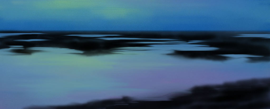
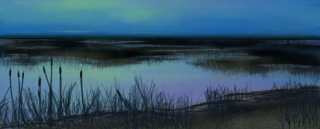
Background
By now you should have a good idea and somewhat of a plan
of how your drawing is going to look. Now, where do you
start? The background of course. Most of the time I start
with the background. This should be smooth and undetailed,
your main focus usually shouldn't be on the background and
should be a little out of focus.
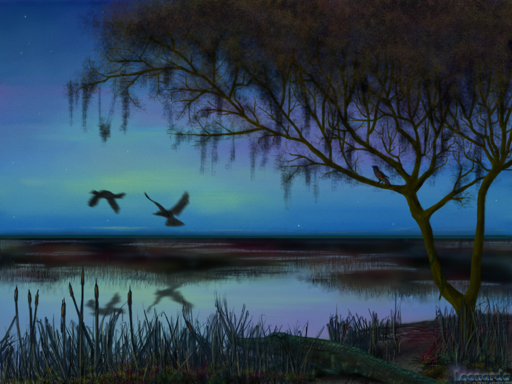
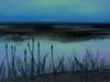
 On this picture I am making a sky for the background. I
started off airbrushing in some thick lines of complementary
colors showing a faintness of clouds and I also used darker
shades at the top. Then, using a smear tool, I blended it
all together. I made sure I didn't miss a line, I mainly
used a large brush with high opacity for the smearing. There
you have it, an easy realistic sky!
On this picture I am making a sky for the background. I
started off airbrushing in some thick lines of complementary
colors showing a faintness of clouds and I also used darker
shades at the top. Then, using a smear tool, I blended it
all together. I made sure I didn't miss a line, I mainly
used a large brush with high opacity for the smearing. There
you have it, an easy realistic sky!
 Now, I knew I was going to have some water in the picture
that reflected the sky. So I simply copied the top 65% of
the sky, flipped it, and moved it to the bottom. I then
took a little of the contrast out and lightened it up. Then,
using the smear tool again, I created some slight ripples,
I used a medium to small brush with about 40% opacity.
Now, I knew I was going to have some water in the picture
that reflected the sky. So I simply copied the top 65% of
the sky, flipped it, and moved it to the bottom. I then
took a little of the contrast out and lightened it up. Then,
using the smear tool again, I created some slight ripples,
I used a medium to small brush with about 40% opacity.
Foreground
 The next step I took on this painting was the middle and
foreground. I decided to go for kind of a swampy - grassy
look, so I started to draw in some black outlines of land
and marshes. After that, I used the smear tool again (btw,
I wish that Photoshop had a more advanced smear/blur tool
- I use it a lot), and using horizontal strokes I smoothed
out the edges in the middle ground closer to the horizon
(the closer the the horizon, the less detail you should
have). Then I wanted to add in some grass that reflected
in the water, so I basically make hundreds of brush strokes
going halfway into the water and halfway above the marsh.
I then touched up unwanted lines with the eraser. After
that I used some green/blue/brown colors and airbrush over
the marsh with a large brush with hardly any opacity, to
soften it up and add a little color.
The next step I took on this painting was the middle and
foreground. I decided to go for kind of a swampy - grassy
look, so I started to draw in some black outlines of land
and marshes. After that, I used the smear tool again (btw,
I wish that Photoshop had a more advanced smear/blur tool
- I use it a lot), and using horizontal strokes I smoothed
out the edges in the middle ground closer to the horizon
(the closer the the horizon, the less detail you should
have). Then I wanted to add in some grass that reflected
in the water, so I basically make hundreds of brush strokes
going halfway into the water and halfway above the marsh.
I then touched up unwanted lines with the eraser. After
that I used some green/blue/brown colors and airbrush over
the marsh with a large brush with hardly any opacity, to
soften it up and add a little color.
 Next I drew the foreground - the space closest to you. It's
important to put a lot of detail here, and to have sharp
edges. Another good thing to do is add more texture in this
area too. This area really needs to stand out. I added some
weeds and stuff here, starting out with solid black lines,
then going back and adding color. I then left the area alone
for a while, so I can concentrate on the tree, I will go
back and add more detail later.
Next I drew the foreground - the space closest to you. It's
important to put a lot of detail here, and to have sharp
edges. Another good thing to do is add more texture in this
area too. This area really needs to stand out. I added some
weeds and stuff here, starting out with solid black lines,
then going back and adding color. I then left the area alone
for a while, so I can concentrate on the tree, I will go
back and add more detail later.
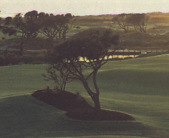
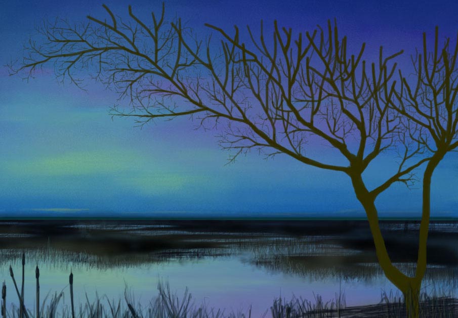
A happy little tree
The tree was actually not complicated at all to draw; I
started out with the basic shape. I drew in the base and
the largest branches first using a dark brown color with
100% opacity, then I used a smaller brush to branch off
more.
 I
continued doing this, as my brush got smaller I was making
more branches off the branches I just made until I was using
the smallest brush. It took a little time painting in all
the tiny twigs (I wish I had a tablet! I hate using the
mouse; I sometimes have to undo 10 times to get the perfect
stroke). Now, the basic outline was done, it looked like
a dead tree. Next I used to burn tool to add shadows on
the tree, and used a lighter brown color with the airbrush
to add in some highlights. Then I created a new brush about
15 pixels wide with tiny dots lined up horizontally for
the wood grain. (Note: I didn't put a lot of detail in the
top of the tree because I was going to add leaves there
anyway.) I
continued doing this, as my brush got smaller I was making
more branches off the branches I just made until I was using
the smallest brush. It took a little time painting in all
the tiny twigs (I wish I had a tablet! I hate using the
mouse; I sometimes have to undo 10 times to get the perfect
stroke). Now, the basic outline was done, it looked like
a dead tree. Next I used to burn tool to add shadows on
the tree, and used a lighter brown color with the airbrush
to add in some highlights. Then I created a new brush about
15 pixels wide with tiny dots lined up horizontally for
the wood grain. (Note: I didn't put a lot of detail in the
top of the tree because I was going to add leaves there
anyway.)
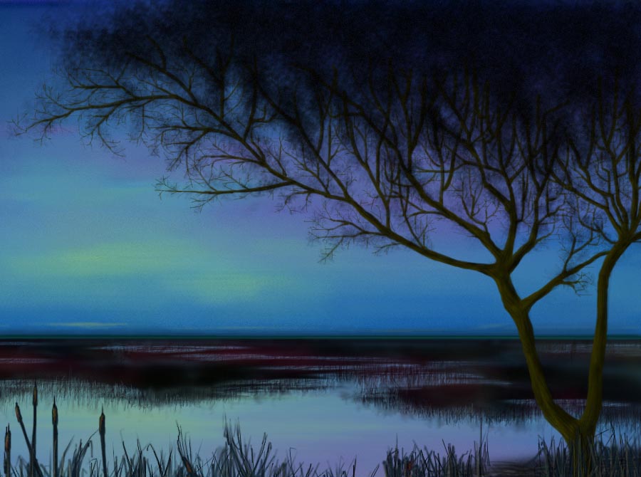
 The treetop and leaves were the next logical step. To do
this I made 3 different brushes each a different size. I
kind of made the brush look like a group of leaves; I also
set the space between 75 and 125. Then using black, I scribbled
in the treetop in a circular motion, making sure I hid the
top of the branches that I didn't put a lot of detail on.
I also used the smaller "leaf brush" dabbed a little bit
around the branches. Next, I chose a dark green color and
highlighted what I had just made. I then did the same with
some yellows and reds (with less opacity). I used the eraser
(also with the "leaf brush") in areas that were too dark,
and let the sky show through a little.
The treetop and leaves were the next logical step. To do
this I made 3 different brushes each a different size. I
kind of made the brush look like a group of leaves; I also
set the space between 75 and 125. Then using black, I scribbled
in the treetop in a circular motion, making sure I hid the
top of the branches that I didn't put a lot of detail on.
I also used the smaller "leaf brush" dabbed a little bit
around the branches. Next, I chose a dark green color and
highlighted what I had just made. I then did the same with
some yellows and reds (with less opacity). I used the eraser
(also with the "leaf brush") in areas that were too dark,
and let the sky show through a little.
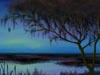 The final step of the tree was to put a little more detail
in it to make it look real. (One thing I've learned: if
you're striving for realism, then you need a lot of detail.)
Using the same "leaf brush", the smaller one, I proceeded
to make some mossy stuff hanging from it. I also went back
and shaded the tree a little better, mainly on the smaller
branches that I missed earlier. When I was completely done
shading and highlighting, I then added some noise to the
tree (setting 7 on the branches and setting 12 on the leaves).
I did this to give it more texture, but mainly to bring
it into focus and separate it from the background.
The final step of the tree was to put a little more detail
in it to make it look real. (One thing I've learned: if
you're striving for realism, then you need a lot of detail.)
Using the same "leaf brush", the smaller one, I proceeded
to make some mossy stuff hanging from it. I also went back
and shaded the tree a little better, mainly on the smaller
branches that I missed earlier. When I was completely done
shading and highlighting, I then added some noise to the
tree (setting 7 on the branches and setting 12 on the leaves).
I did this to give it more texture, but mainly to bring
it into focus and separate it from the background.
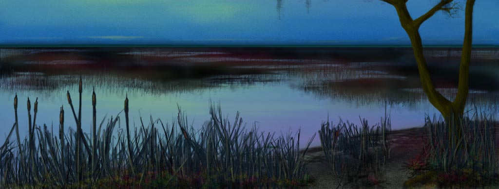
The final details
 Now the drawing was starting to look like something, but
it needed something else to give it character. First I went
back to the shoreline (in front), and added more detail,
I made the weeds darker and more defined. I also added some
color in too (some lighter greens, reds, and yellows). Then
I took that layer and added some noise to it (from here
on out I will make all the objects in the foreground have
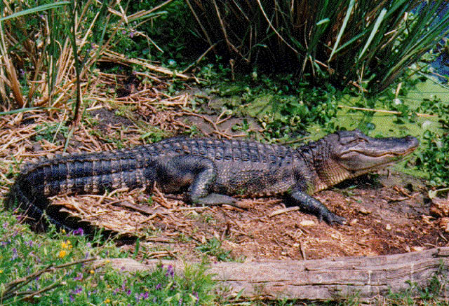
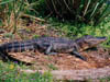
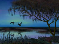
noise setting between 6 and 10). Next I put some wildlife
into my swamp, starting with a crocodile. Then I put a bird
sitting in the tree; I also put a snake winding around the
base of the tree. I also added some noise to these 3 objects.
After that, I drew some birds taking off over the swamp.
Then I copied the birds, flipped them, and used it as a
reflection in the water. I used the smear tool over the
refection to show some rippling. Finally I added a few morning
stars to the sky.
Now the drawing was starting to look like something, but
it needed something else to give it character. First I went
back to the shoreline (in front), and added more detail,
I made the weeds darker and more defined. I also added some
color in too (some lighter greens, reds, and yellows). Then
I took that layer and added some noise to it (from here
on out I will make all the objects in the foreground have
noise setting between 6 and 10). Next I put some wildlife
into my swamp, starting with a crocodile. Then I put a bird
sitting in the tree; I also put a snake winding around the
base of the tree. I also added some noise to these 3 objects.
After that, I drew some birds taking off over the swamp.
Then I copied the birds, flipped them, and used it as a
reflection in the water. I used the smear tool over the
refection to show some rippling. Finally I added a few morning
stars to the sky.
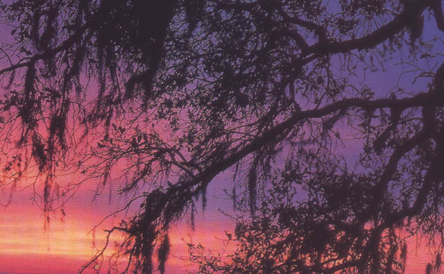
Throughout the drawing I tried to keep things consistent.
I used a wide pallet of colors, but they are all balanced,
and they all kind of complement each other. The lighting
is another important element to consider. It is either early
morning or late night so I didn't use light colors or bright
colors in the foreground. But on some of the highlights,
like on the crocodile, I used brighter colors to reflect
the sky. I also kept textures consistent. If one area of
the foreground was sharp, then the rest had to be. I also
kept the background soft and little out of focus.
I hope this was helpful and informative for you. If you
have any questions or comments on this tutorial or want
more information about my artwork, then visit my
homepage. Or, if you're lucky I can be found on #iCE
every once in a while.
Tutorial by Leonardo.iCE
Copyright © 1999

|