| |
cain
this is the way i start my fonts, ill
do my first letter, and seeing as how tripomatic fairytales
is a little long, so ill make this font for "trip" .. a small
acronym of tripomatic fairytales. Ok, first letter,
a t..
its quite simple to start .. start with a pretty little shape.. like this:
|
|
Step 1
ok boring, and no shaping to it.. no smooth shaping anyway.
so lets fix that ..
|
|
Step 2
take and add some l's and :'s they make a smooth line, what we like to call kwestphunk, and thats the first part of it, there is a few other tricks but this is the first =) .. ok, now that the "t" shape looks cool, lets a the next steps..
|
|
|
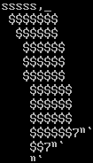
Step 3
okely dokely.. no you can prolly see the next step..
click for proper size
this is a kewstphunk link. with these little gadgets, its really ezee to form other letters
you'll see, cuz we have an r to do n.
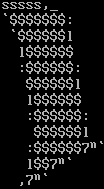
Step 4
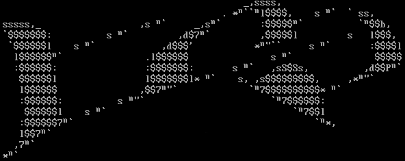
click for proper size
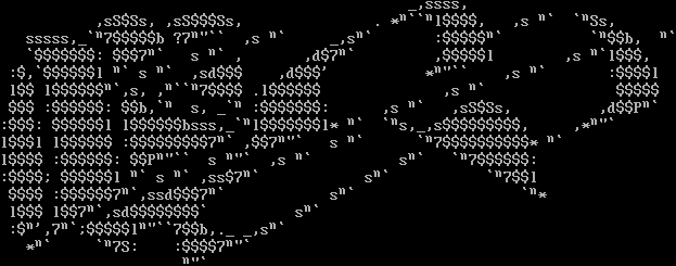
ok, you see how everything is connected?.. sPIFFY =) .. but theres still more, but this part was to show you how kwestphunk step #2 works out.. now, the kwestphunk shape step..
and i did the i and the p too..
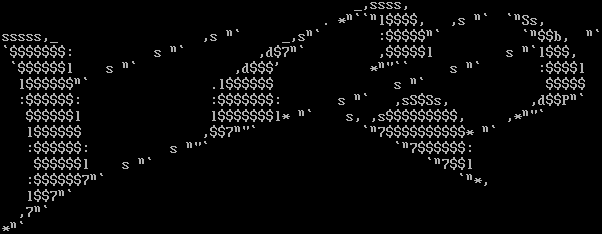
click for proper size
Step 5
shaping a kwestphunk font is EASY .. mainly using l's and :'s.. just make riged edges, and shape the l's and :'s into them .. like below..
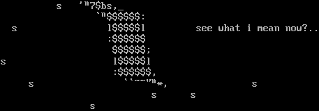
Step 6
ok, back the font =) .. it looks cool.. but it needs a background..
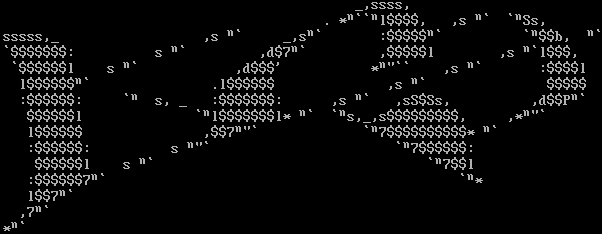
click for proper size
back ground styling all depends in the artist who is drawing the logo.. some like to link the back ground into the ascii.. and some like to build it around.. with my kwestphunk stylee, i do both =).. check it out..
click for proper size
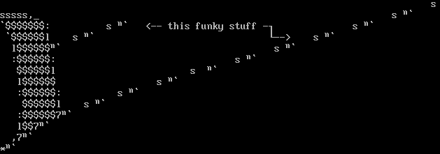
anyways i think you get what im getting at.. be funky, and let it flow.. ill finish the ascii now..
with some extra pointers at the bottom..
Final Ascii
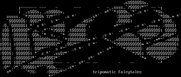
click for proper size

|