| |
halaster
-- How to draw the Halaster way..

|
|
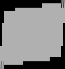
Step 1, shape -
ok .. here, we have a very simple shape. that's
neat, if you want a very simple ansi.
the first rule of halaster shading is to never
leave any shape in it's basic form. so we're gonna
distort this little bugger .. like a so.
|
|
|
Step 2, fucked up shape -
so it may not look grand now, just bear with me.
at least it was a little harder to draw than
the regular square.
|

|
|
Step 3, color -
there are two main types of colors in ansi. one type
shades real well, the other doesn't. simple, eh?
i'll show you how to shade both.
|
|
|
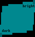
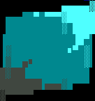
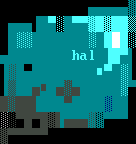
Step 4, color that shades good -
ok, here i've chosen cyan .. one of the easiest to shade
colors .. now, the first thing to do is to decide
where the light source will be.
for this example, i've chosen dark to be lower-left.
and bright to be upper-right.
|
|
|
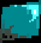
Step 5, color swirls -
i never ever ever do straight line bright spots and only
use shading as detail work. here i've mapped out the
bright spots.
|

|
|
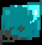
Step 6, cartoon borders -
another neat trick is to use cartoon borders on the
edges oh a shape .. i only do it with brights, however.
this square really doesn't show the potential of borders
that well .. i suggest you look at some other pics. :)
|
|
|
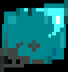
Step 7, extremes -
the next step in halshade is to go to extremes .. this
means little bright spots and little spots of complete
black should be in the center of the shade regions.
color 7, 15, and color 0 work best for this.
|

|
|
Step 8, the 'plus' -
a great shading technique that i picked up from lord
jazz, sushi-x and maestro is the plus. while some people
hate it, i think it's a great way to add 'grit' to a pic.
the chromatic is a nice touch, too.
|
|
|
Step 9, random shade -
i like to throw random colors into my work ..
but i always choose colors that are in other parts
of the picture .. for example, imagine that there's
a blue square nearby for this example.
|
|
|
Step 10, the pnakotic -
here's something i learned from pnakotic.


throw in the high intensity f1 and 2's to add more grit.
also use f3's of the primary color.
|
|
|
Step 11 the _ and _ reversal -
another neat trick is swapping ¦'s for _'s and vice-
versa .. check it out.
|
|
|
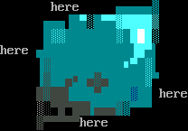
Step 12, last touches -
here's where you do pic-specific things. like your
initials and stuff. or extra random shading.
|
Which do you prefer?
|
|
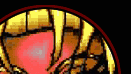
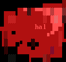
hard color -
the only thing you'll have to do with hard colors
is eliminate the extremes and, sometimes, cut out all
color 8 .. check this red square.
hard colors = red, green and blue.
if you really need the full shape, you can use light
color 8 shading.
|

|