| |
the
knight (Fluph)
yo, the knight talking here ....
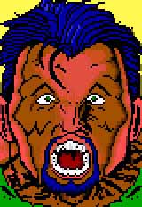
this is the basic version i recieved from this ansi... i'll take
you through my "fixing process" in different steps, so you
should be able to follow more or less what i did...
i didn't save the ansi each time i changed something,
so there might be some flaws in it.. i'm sorry for that inconvenience..
|
|
Step
2:
i outlined the hair on top to make the shadow look thicker,
it creates a larger contrast with the background.. this
also leaves you more room to let the hair sorta "flow" into
the background. you can do this by just adding a little
black space into the background.
|
eg:
Step 2b: i removed the awkward yellow glow on the right side
of the face. if you want to highlight areas where the lightsource
comes from, you can add little shadeblocks to it, but if you use
full colored blocks, the result will most of the time look pretty
crappy (unless when you're doing real toons)
Step 2c: reshaped the round size of the head
at the top right, because if the hair falls over that area, it can't
possibly recieve as much light there as in the lower areas... what's
more, it adds confusion because it's the same color as the backround..
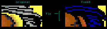
Step 2d: by this time you will also have noticed that i totally
removed the light grey glow on the hair at the left side..
again, if you want to add highlight to that area,
don't change the color too abruptly... you can for instance change
the color from dark blue to light blue, but changing it from dk/blue
to lt/grey is a bit heavy :) i think this is pretty easy to understand,
if not, let me spell it out for you :)

ps: it's not really "impossible" to use socalled unmixable
colors, but i guess your name has to be dieznyik, flame or ville
to actually do it with "grace" :)... i'm just saying... if you do
it at ONE point in your picture, you better go all the way with
the wacky color- combinations..
Step 2e: what else did i change at this stage
... ah yes.. notice how i made the left side of the face a bit thinner...
i dunno why i really did this, it kinda looked better i guess...
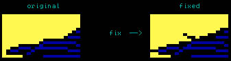
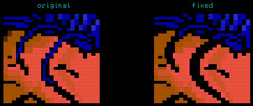
Step 2f: another quite difficult thing is
drawing hair "over" a face. in this particular ansi, the drawer
tried to grasp the image as "true" as possible by adding the haircolor
into the black spaces.. look down for example. this is how any normal
guy would do it :).. but you must remember that you are dealing
with ansi, so you don't have a whole lot of space :).. a better
solution is to just leave the spaces black. and just let the mind
do the work for you. take a look at the following fix.
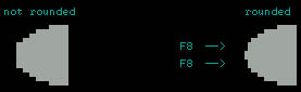
ps: also when you're using this technique, don't be afraid
to make the strings of hair look thicker than they are on the original.
it is much easier to let the hair bend and flow if it is thicker..
and oh yeah, do not forget to use the F7 and F8 keys to "round"
off the shapes. not only for hairstuffs :)
[steps 1 & 2] step
3 steps
4 & 5

|