| |
ACiD
#77 - score: 7.5 out of 10
Atom:
[this review is based on the release on www.acid.org,
and not the archived version.
The following
introduction about Night Crawler is not endorsed by hirez.org
and does not reflect our opinions in any way (except for
Atom). Night Crawler is free to email me (mongi)
his response and it will get posted. -ed]
Before I even start, I want
to get this out: I do harbor a bias here. Not against acid,
but against one of their new artists, Night Crawler. In
as few words as possible:
<N-Crawler> all you
guys do is photomanips
<N-Crawler> that takes no skill just photoshop knowledge
You were kicked by N-Crawler (ai!)[ come hell or highwater
i aint unbanning you] (ai!) Session Ident: N-Crawler (n-crawler@dynip-216.44.107.73.nyct.net)
[10:56] <N-Crawler> watch your back
[10:56] <atom128> ill be looking out for scary fat
men without pants
[10:56] <N-Crawler> no
[10:56] <N-Crawler> i would disconnect little bitch
[10:56] <N-Crawler> and watch my back
[10:56] <N-Crawler> cuz your modem should be catching
fire soon
[10:57] <atom128> wow this sounds familiar
[10:57] <N-Crawler> plus
[10:57] <N-Crawler> i would watch your channel too
[10:57] <N-Crawler> have a nice day
[10:57] <atom128> which one
[10:57] <atom128> i have 7
[10:57] <N-Crawler> hahaha
[10:57] <N-Crawler> Listen kid
[10:57] <N-Crawler> your an arrogant little fuck
[10:58] <N-Crawler> and im gonna solve that problem
[10:58] <N-Crawler> you should learn who to piss off
[10:58] <N-Crawler> and who not to
A few minutes later all my
downloads ceased and my bandwidth was filled with garbage.
I pinged out of IRC, and was disconnected. I reconnected,
got a firewall set up, and haven't had a problem since.
He denies responsibility. That's not the complete session,
but you can get the idea why we don't quite see things straight.
So that's out of the way.
The pack starts out with three
pics by AXB. The first one would've been much cooler if
there wasn't that filter on top. The shading and atmosphere
is great, but the filter just killed it. His second pic,
of a cross section (sorta) of a face, however, is really
good. The shading and detail are top notch, as is the concept.
AXB's quality really jumps around here. His third picture
is of some flat (rendered?) flowers, than smeared with the
smudge tool on a high contrast background. Not very good,
no focus or anything.
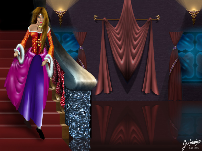
Blup's pic has a synthetic
feeling that doesn't work to well in a gothic atmosphere.
Parts of it, such as the stairway, might even been renderings,
but I'm not sure. Her clothes look too shiny, as if they
are made of a synthetic plastic-like fabric, and the folds
in the cloth hanging to the right look too stiff. Her hand
is messed up too. I know you can do better, Blup.
Catbones' airbrush is alright,
the water on the lily is excellent however, but on a darker
background, and without the acid font, the pic would've
been much better in my opinion.
The film promo by Digital Interface
is OK, the renderings are all good, but the font and lensflare
don't work. I would've done something different with the
white text as well.
Grim's pic rocks. The texture
and ambience is wonderful, of a man sitting on a park bench
next to a refinery of some sort. I'm in awe. The grim logo
would make Sprocket proud, as well.
Jason's work has always been
a mixed bag for me. In kivakukka, I really like the background,
the colors are nice, but the foreground flower doesn't work
for me. Space flower, I like a lot, but the background texture/noise
doesn't work. It would've been better smooth.
Lk's graffiti pic is good-for
a graf pic. I've never been much of a fan of small logos
(though I do love large murals) but his use of color here
and the sketchiness of the lines is pretty nice. His second
pic, using primarily the smudge tool, is pretty cool. The
use of the circles, which reminds me a bit of Catbones,
is good, but I really like the use of the squares and circles,
as seen in the lower right corner.
The cartoon colly by Night
Crawler isn't too good. His proportions are poor, even for
cartoons, the top right character's face and hand are pretty
mutilated. The best one is the one in the left corner, with
the turtle (who reminds me of the koopa from Mario Bros.)
eating a diskette. Oddly, the lines are very sharp and not
anti-aliased in this one, in contrast to the others. Just
doesn't fit. Thirdly, the layout is terrible. He should
take a lesson from Sprocket in how to layout collys. The
graffiti logo I just don't understand. He probably drew
it during class or something. You'd think that people had
enough pride in their work to clean it up after they scanned
it from lined paper, maybe smooth the shading. He could've
at least layermasked the edges of the paper so it wasn't
such a sharp edge where the lines end at the bottom. Acid
is a _digital_ art group for crying out loud, not a class
doodle group. Also, after going to all that trouble to draw
an acid font, why did he sign it with a graffiti-esque TTF
(brooklyn kid)?
Optik Nurv's pics aren't too
good either. Essence, which appears to be a photomanip (sorta)
is extremely muddy, and disorganized. There are blurry right
angles which just don't work. Lotus is a graffiti logo with
neon colors inside, on top of a dsb flux background (radial
mosaic). Too bright/halluginogenic for me. His joint, with
lms (?) is similar, very muddy. The cartoons are alright,
with their sharp edges, but the shading is non existent,
with colors all over the place, that look like they are
on exclusion or difference layers just airbrushed on top.
Sc00p is a new member to Acid,
I think. I've known him from #photoshop (which I am banned
from thanks to one N-Crawler), and #hirez. His first piece,
acidfilter, has a nice layout, but the cartoon is very pencily,
which doesn't fit with the smoothness of everything else.
It's also a bit irregular, but these are minor complaints.
Mindstorm is good, the splatter-ness (if that's a word)
around the text works very well, as does the eye and the
mosaic. I could see this on a rave flyer, defiantly. Neo-Junky
isn't as good, the face is only fairly drawn. The font is
well done, though.
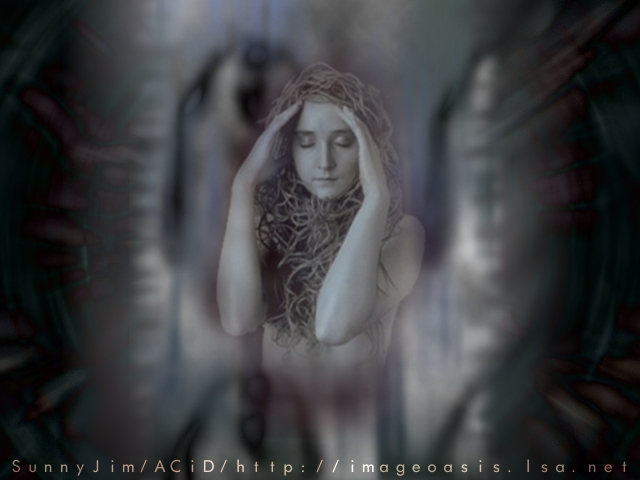
SunnyJim in Acid
The end
of civilization as we know it. (heh. /me pokes sunny)
Another
#photoshop op makes his way to the artscene (scoop, nc,
and him, all in this pack). Had I made this pic, I wouldn't
have depended so much on the photo of the girl, and incorporated
other elements. It's too simplistic, for a lack of a better
term. His second pic is of a girl sitting, looking at a
city, in a surreal, futuristic world. Sunny takes the opposite
approach to photomanip as I, he tries to create a scene,
while I try to create an emotion. Of course I prefer my
approach better (duh, it's mine), but his is not half bad.
My complaint is that the elements still feel very separate,
as if they were after thoughts.
V3ngance has what appears to
be an oil pastel. It's similar to his other stuff, down
to the color usage. Not much to say really, but I prefer
his computer pieces, with sharper edges.
Zozzy seriously kicks ass.
His painterly style is great, with a convincing atmosphere.
Alone really matches the quote of "sooner or later we are
all alone". In breakthrough, he has drawn the most convincing
metal texture I have seen in a long, long time. The reflections
are near perfect. Even the lensflare in this pic is well
drawn. Overflow is incredibly detailed. Every line is sharp,
enough to make me wonder if he pixeled it. The lower lip
is a little off, though, but it's minor. Wildthoughts is
amazing. The colors and detail are excellent, and this is
easily the highlight of the pack.
I really like madASScow's
sculpture, Nazi Scum. It has a lot of emotion, and the flower
at the bottom is a nice touch. The Patch Kids image would
be a little more appropriate for the Project, if you ask
me.
The Acid logo (unsigned) is
interesting, the background is interesting, but overall
very dark on my monitor.
Ffathom's piece, eyes, is very
nice, an excellent use of whatever program he uses (I know
its not Photoshop, he told me once, it's all smudge tool).
The shading, proportions, lighting, etc. are all top notch.
score: 7.5

|