|
HRg
#23 score:
8 out of 10
Mongi:
Once again, HRg releases
an original and artistic pack. I don't have any "complaints"
really, this will mostly be descriptions of how good the
work is.
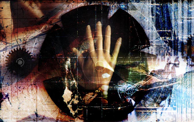
2302dh.jpg by Darkhalo really
fascinates me. The composition throughout the pic is amazing.
First off the way the framing has been done reminds me of
ansi framing, a continuous pattern (in this case women)
that's more or less complex. It's very well done with good
alignment. Then it's the lighting and the swirls that make
good contrast to the dark background. The lights look very
realistic.
Sprocket seems to be upset
(as a lot of other people) after last month's heated discussions.
Still he might have liked it, since he advertises for it
=) Anyway, the composition is great in the photomanip, and
he has put much work in details.
Inc0gnito has become one of
my favorites in a very short time. The brushwork and color
theme composition is a pleasure for the eyes. The Kenjutsu
piece is truly good work. Whatever the intention was, it
gives a feeling of movement and the mood you get when going
to kendo competitions (I've seen quite a few). Using a technique
that doesn't really show the details, but still a very complete
and professional feel to the piece is very difficult to
achieve.
Yoyo's "Mother Lore Island"
(2313yoyo.jpg) shows great imagination. Surrealism is not
as easy as it seem to paint. Being a bit humoristic and
dark at the same time, and not at all perverted (as many
other surrealists are), Yoyo has a unique style. 2326yoyo.jpg
shows another side of Yoyo. Keeping the wild imagination,
it looks a bit cubistic.
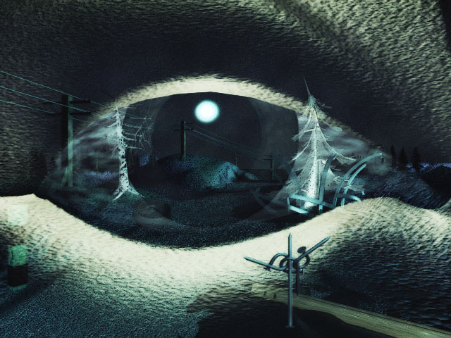
2324hz.jpg by Hazar really
made me think. At a quick glance it looks like a snowy landscape
with phone/electric lines in the background. But then you
see the huge eye covering the whole pic. What did he want
to express? It really bothers me not being able to interpret
this piece.
Sayonara seem to have been
inspired by Yoyo, the theme is what Yoyo could have thought
of. The other pieces in the pack are all original and different
compared to conventional "scene-art", even the
photomanips by Atom and Sprocket have a new approach to
design and layout. They all have substance and much work
in them, just as the best photomanips I've before, only
these are better.
score 8.5
Root88:
Incognitos Kenjutsu pic was my favorite in this pack, outstanding
bush work and use of colors and contrast.
All of the photomanips
in this pack are excellent (yes this includes Sprockets).
This is the first time Ive ever seen a pack full of them
and thought that. Usually, youll see a bunch of clipart
that looks like it had a few filters on it, not in this
case. All the photomanips in this pack used pics that when
brought together gave them a new feel and meaning. If you
ever peeked inside a copy of Discover magazine, you would
see images with the same sort of style and quality. This
is not meant as an insult, I am trying to point out the
merit of these images.
2302DH.JPG could contain
Poser models and lens flares (Im not sure), and I still
enjoyed it. Normally I complain about Poser models being
used in an image, but that only applies when the it seems
as if the artist is attempting to show off his 3d skills,
by throwing someone elses model in front of a brick wall
or a on Bryce mountain. In this case its used more as a
photomanip. The "lens flares"(?) were not obstructive to
the rest of the image and were recolored so that they flowed
nicely into the artwork. I would really like to know how
he made the swirls around the females down the center of
the pic.
2308US.JPG looks good,
hey God Among Lice, you only left yourself 1%, you deserve
a bit more credit than that.
2316BLUP.JPG (Guest pic
by Blup of ACiD) I like your background. Its color and the
way the peoples shoulders come together make it look like
a heart. Very interesting, but if that was the intention,
it could have stood out a little more, I had to look at
the pic a few times to pick up on it.
score: 7

|