|
HRg
#24 score:
7.5 out of 10
Mongi:
Incognito is one
of the artscene true abstractionists. Although the style
is established (Hans Hofmann and Joseph Diebenkorn I was
told), Incognito have implemented a more digital touch to
it. A main difference is the cleverly added texture to the
big empty surfaces, and more variation in colors. It would
be very impressive if these were to be seen in a bigger
format than the monitor.
Massive's photomanips are the
best I've seen in a while. They really give a nitghmare-ish
feeling. 2408mse.jpg reminds me of the Corinthian from the
Sandman comics, it looks like Dave McKean could have done
it! The composition of the different photos, the added graphical
touch-ups such as the scratches, and the smooth transitions
are top notch.
Sprocket's logo-colly was very
well designed, but not as innovative as his work a couple
of months ago. They aren't as daring as they used to be,
and the use of truetype fonts is more obvious.
Darkhalo's 2417dh.jpg is very
interesting. It looks rendered, but the intricate shapes
are unbelievably complex. Just as his other work, he's juggling
a lot with lights, and making the flashes come together
right impresses me.
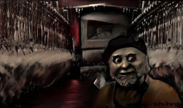
2418sh.jpg by Shart is pretty
neat. While the overall pic looks like dark underground
(can't make out what it actually is), the main character
looks really happy and at the same time a bit afraid, a
bit like Mona Lisa =) The brush work is well done and it
could as well be a real painting.
The Massive and Atom joints
are really dark and gives
a creepy feeling, which I like a lot. 2419us.jpg by Atom
and YoYo shows what you can get out of a joint, using YoYo's
great surreal imagination and Atom's refined graphical technique.
The pack has been darker and more provocative than usual,
really standing out from the crowd.
score 7.5
Root88:
My reviews of Incognito's works in this pack were consistent
with his releases in CIAs pack.
2407mse.jpg was and image that
I really liked. Im not sure why, but I left it on my screen
and stared into it for quite a while. There is something
intriguing about this image but I cant explain what it
is.
Massives Nightmares photomanip
is an excellent example of what a photomanip should be.
The textures, images, and ideas within were all interesting.
I liked that he added the scan of the scissors to complete
the cut theme involved. An added bonus was that Massive
took all the photographs himself.
2416sng.img was another commendable
image. The angle and position of the character are original
ones. The color scheme suited the picture very well, and
the circular and straight lines that were added gave motion
to the image without interfering with the rest of the picture.
2417dh.jpg was well done. Overall
an admirable piece.
I REALLY liked Sprockets 2421spro.jpg.
I liked everything about it, the angle of the scene, the
colors, lines, textures, the cigarette, and the glare from
the monitor. It looks like our work environments are very
similar. A smoke in the dark is just what I need to get
my creative juices flowing.
2423lice.jpg is exactly what
I think a photomanip should not be.
2428sng.jpg was another excellent
work in this months release. The color choices were superb.
There was nice, although somewhat inconsistent shading.
I really wonder what this kid opened the door and looked
in on. Any picture that makes me think, even for just a
second, was a good one.
score: 7

|