| |
iCE
9901 - score: 7 out of 10
Atom:
Funny, how both of the largest artgroups in the scene should
have such strong artpacks in one month, after a bit of a
drought from both. Well, I guess it was a good month.
The iCE pack starts out with
an Escher like tessellation from Root88. It's nice, looks
kind of like a cross between a twisted fish and the mask
from scream... But i think it's a fish. I think Root could've
done a lot more with this one. As I said, it's nice and
all, but that's all it is, a tessellation. Might've done
what Escher himself often did, and make the tessellation
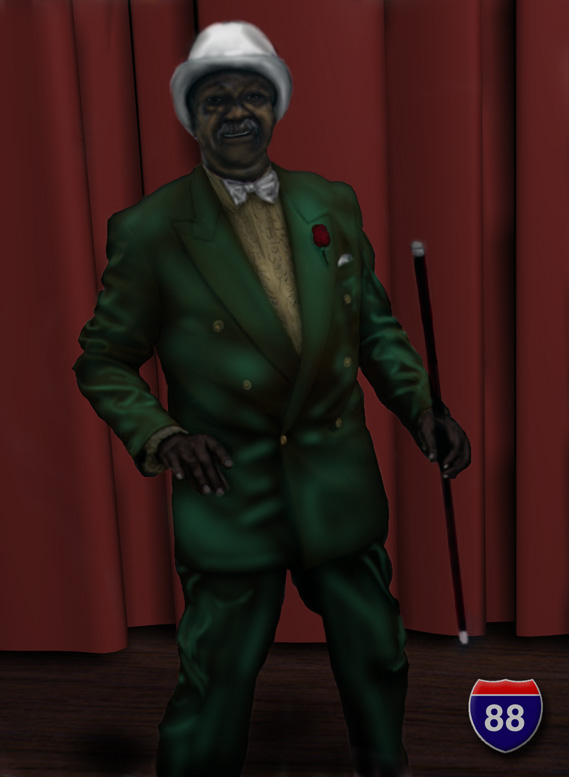
fit into a larger scene. The next picture from Root is of
a black entertainer. The shading here rocks. Very well done,
you can practically see the shine in his coat. His hat could've
used a little help though, it's weird seeing brush strokes
in a picture that is so smooth for the rest. Then we have
a photomanip by Root, and I really like this. It uses a
sepia toned color scheme, and the mechanical photos are
really a nice touch. I like how the hand with the cigarette
seems to flow from his, well... I think it's the nose. What
most impressed me was how he used _purchased_ stock photos.
I envy his budget, or his connections :).
After Root's things we have
a rendering by Digital Interface, which isn't as good. It's
kind of lifeless, and the textures are either lacking, or
not right. I do like the bug/alligator with wings on the
middle finger.
This is followed by two fantasy
renderings which don't do much for me. Too lifeless, too
flat. Not much I can really say. He then has a logo for
a recording company, but, while its a nice design, it would've
been oh so much cooler with a different font. Then we have
ANOTHER rendering, which is well... quite titillating :)
(i really like that word). The faces were really well modeled
and doing the hair like that must've been a bitch!
DaVinci (does anyone else find
it weird that iCE has a leonardo AND a davinci? And they're
different people? [yes indeed =) -ed])
has a logo for Cinetropic. The border is good, but the font
isn't too exciting. He follows with a web interface he did
for Phrozen Crew, which used the dragon he released in hrg23.
I like the black object behind the buttons, really complex
and it reminds me of those iron gates... You know :)
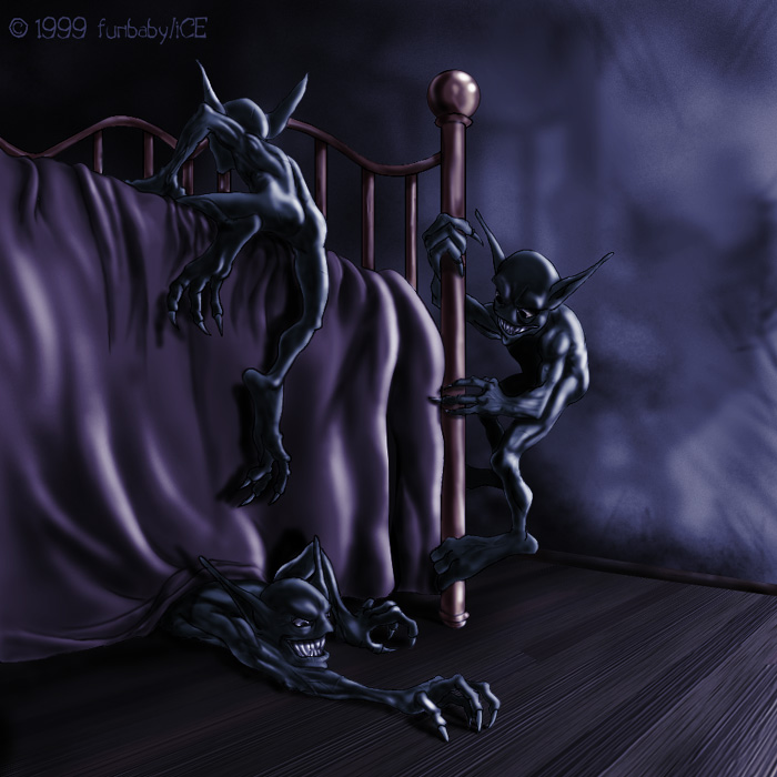
Funbaby makes his debut in
iCE this month, and its pretty damn good. I remember meeting
him in #photoshop before he knew what the hirez scene was
:). The floor texture and perspective is great, and the
wall texture is stunning. Everything is very sharp and crisp.
And I _KNOW_ that I've had dreams like that before. Then
he has a violent picture of two chicks blasting the crap
out of stuff, and it reminds me of the logo to Duke Nukem,
or Doom, with girls (w00t). The proportions are a little
whacked though, but everything is sharp once again. Nice
work, but the first one was better.
Hfaze has some really nice
stuff this pack, with an Illustrator-ish girl, on front
of some bright, vibrant backgrounds. All three, while quite
similar, are pretty nice. My favorite is the second one.
Jae's picture in this pack
has to be my favorite this month. The lighting is perfect,
the mood excellent, and just the pure fact that it reminds
me of The Wind in the Willows makes it worth it. If nothing
else, this is what makes this iCE pack good.
Leo than has a skunk or something,
and, while its nice and all, some of the shading isn't accentuated
enough, and it looks very flat. I must protest, however,
his logo reminds me of the Geocities font, which sends shivers
down my spine. And question: Why the hell are his eyes blood
shot? Do I want to know? :). His next picture, however,
is really good. As the tutorial
for this picture (which can be seen on hirez.org) mentions,
it reminds me of HAPPY TREES! The mad painter guy with a
fro on PBS. I personally think this pic would've been better
without the alligator, but the birds are really a nice touch.
Mongi's picture, which is like
the series he had a while back of the gold men, is nice.
The other ones were better, but as he mentioned, he accidentally
flattened and wrote over his PSD, which... and i know this
from experience... REALLY SUCKS. This image isn't bad, but
I yearn for what it could've been.
Necro's pic is very demoscene-ish,
reminds me of something Boris Vallejo would do. While, I
can't say I really enjoy fantasy art, because I don't, it's
good technically speaking. The waterfall is a good touch.
RK (I couldn't read his signature,
it was to dark) [Ian Dale aka RoadKyll -ed]
has a nice rendering of a dilapidated African village. The
hands on the man are what really stand out to me, they are
done well. One can even see the joints and knuckles. His
face is a tad messed up, and the ground would've been better
a little more irregular and hilly. It couldn't have hurt
to add some dust or something to fade out. I always imagined
Africa dusty (never been there).
Steven Stahlberg has a rendering
of yet ANOTHER girl on a motorcycle. Some of the muscles,
especially on her torso, are a little too accentuated, but
her face/hair/metalthignstickingoutofherhead (heh) are really
nice.
Tetanus made his hirez debut
[No, it's not his debut. Sorry for all my
comments -ed], and alot of people, from the sounds
of the hirez.org discussion board, were really blown away
with these. I however, like God Among Lice, weren't. They're
not bad, or anything, they're just not great. I can see
the texture filter in Photoshop on the mountain in the first
picture, and I think i can see the smudge tool in his second.
They're very fantasy/sci-fi oriented, and while some people
may trip over stuff like this, i wasn't too impressed. Continuing,
his skull picture was very flat and blurry, and I saw a
lensflare in the center of his space scene. As I said, they
weren't bad... They just weren't good, either.
Tim Wallace has a bunch of
his Colony renderings, this time including a human. The
same human. I actually thought this series was really funny,
but I'm not sure how intentional that was. While greeting
alien robots, he has a silly grin. While being surrounded
by robots with guns, he has a silly grin. I think his eyes
are even pointing in the same direction. Walking through
an alien landscape, he has that silly grin. Readying his
gun over a chasm, he has that silly grin. Conversing with
robots, that silly grin. I was in hysterics... I laughed,
I cried... I spasmed.
Vesalius has a hippie web design
company logo/interface, and its not that great. It's kind
of flat, and reminds me of the stuff I see in school text
books. Good concept, not carried out too well.
I guess I should mention the
.rip, because I consider it hirez, just because there are
so many ripscript artists who idle in #hirez :). The
first two were good comic rips, but that's all they were,
comic rips... And the fonts, as the artist himself admitted,
stank. The next one, which was a promo for Souls, was cool.
I really liked the font on this one, and the background
was good, but I didn't care for the character.
And so concludes the iCE pack.
score: 7

|