| |
 |
Tutorial
by DaVinci
this tutorial assumes you have a working knowledge
of photoshop's tools. If you don't, please learn the
tools before attempting these lessons. |
|
Step 1.)
Using the type mask tool and a heavy, non-serif font,
and fill with a light yellow color. |
Step 2.)
Create a new layer above your first layer, make it
the active layer, press the ctrl key and click on
the the first layer to create a selection. Select
a medium brown color and a 75 pixel soft airbrush with
pressure set to 35, and brush horizontally across your
type allowing the yellow first layer to show through
on the bottom.
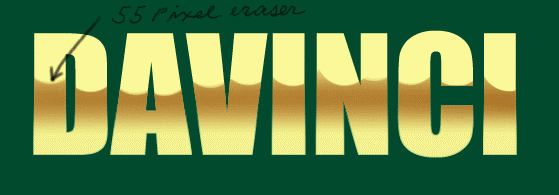
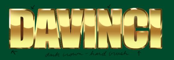
Now take a 55 pixel eraser, and make sure its softness
is set to zero and pressure is set to 100. Erase parts
of this layer as in the illustration above. What you
are doing is creating the "horizon" line for
the bright gold effect. You can make your erasures irregular
as I have done here. This gives a more realistic effect.
Tip: pressing the ctrl key as you spray
constrains the movement to left-right or up-down so
you can achieve a nice, straight line. Tip:
ctrl-H will "hide" your selection. I usually
hide my selections because I find them distracting when
doing precise painting. Ctrl-H again un-hides the selection. |
Step 3.)
Create another new layer above the first two, make
it the active layer, and spray a medium brown on
top of your text. Your selection of layer 1 should
still be active unless you turned it off. If you
did, then make sure it's selected. |
Step 4,
The bevel ) Create a new layer above the background
layer, and open the SELECT drop-down menu and click
MODIFY/EXPAND and enter 5 pixels in the dialog box.
You will now see your selection "grow" by
5 pixels. Fill this selection with the same light yellow
as in step 1. Tip: alt-del is the keyboard
shortcut for filling a selection. |
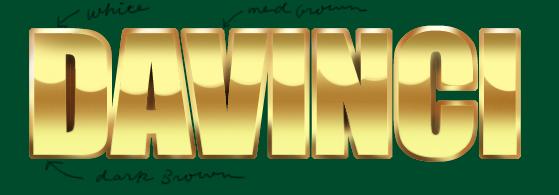
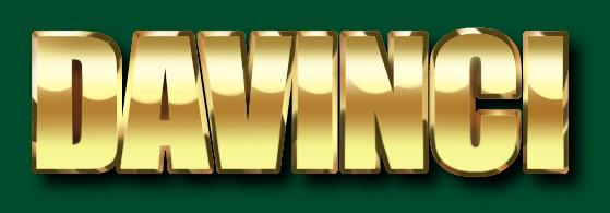
Step 5.)
As in the illustration above, use the airbrush tool
and white, medium brown, and dark brown colors to give
body and depth to the layer you made in the previous
step. Note that the dark brown is used on the bottom
and white and light brown on the top portions of the
type. Pay particular attention to the corners of the
letters as this is where the shading will be more pronounced. |
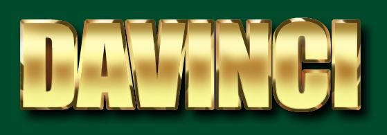
Step 6.)
Your selection of the the expanded type should still
be active. If not, make sure it's selected. Switch your
airbrush to a hard brush and in a semi-random way, paint
in some dark areas on a new layer. There should be more
dark toward the bottom and a little less on the top.
You can see that I've darkened the top corners
of the letters. If you darken a little too much, use
a hard eraser and remove part. What we are doing here
is simulating a polished bevel that's reflecting its
surroundings, and the hard brush makes it's appear shinier.
With a little experimentation you can achieve very realistic
reflective surfaces. |
Step 7.)
For the last step we create another new layer (make
it the top layer), make it the active layer, do a ctrl-click
on our original text layer to make a selection. Using
the airbrush tool and a soft brush about 50 pixels in
diameter, spray a white "shine" across the
top portion of the text. To top off the effect, I added
a drop shadow which gives our type even more depth.
|
Optional
step ) For a softer "brushed" finish,
I did a 6 pixel blur of the Step 2 layer (make sure
that the Step 2 layer is selected! You want the blurring
to be within the selection), and then lowered
the opacity of the step 7 layer. As you can see, it's
a different effect altogether, and one you might find
useful.
IN CONCLUSION
This tutorial shows one approach to metallic
text. Once the mechanics of this technique are learned,
you can experiment with different colors, textures,
etc. Good luck! ~DaVinci
|

|